 Call us:


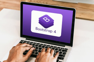
Responsive Web Development with Bootstrap 4
-
 By
Sonar Systems
By
Sonar Systems
- 20/09/2021
Course Description
This short, free online web development tutorial covers all the tactics you need to get started with using Bootstrap 4 to create responsive websites. The course begins with a detailed demonstration of how to download Bootstrap 4 and set up a project. It goes on to explain the grid system, how it is used in creating responsive elements on a webpage, as well as the process of creating and manipulating jumbotrons, alerts, labels, media objects, bootstrap buttons, and cards.
The second half of this web development class sets its focus on webpage navigation tools. It begins with a detailed explanation of how to create and organize navs, and bootstrap navbars, as well as explanations on how to make them responsive and collapsible. This is followed by demonstrations on adding breadcrumbs, pagers, list groups, modals, progress bars, and pagination. This web development training concludes with an explanation of the process of creating tooltips, popovers, collapsible content, carousels, and how to use utility classes.
This course will provide the bulk of the information you need to create highly responsive, good-looking, and functional websites using Bootstrap 4, which has been used in designing websites for some of the most successful companies in the world. Responsive web design is considered the standard for websites and is always a valuable tool to have, for any developer. Whether you are new to web design, or an experienced developer, enrolling in this course will definitely improve your skills in responsive web design with Bootstrap 4 – in just 3 hours.
What you'll learn in this course?
-
Front End Developer
-
Responsive Design
-
Full Stack Development
-
Web Design
-
Web Development
-
Bootstrap
Course Curriculum
Sonar Systems
Sonar-Systems
 Duration
 Modules
 Certifications